library(buzzr) # for shaping buzzdetect results
library(dplyr)
dir_data <- 'data/intermediate/full_results' # your results should be here relative to the working directoryOverview
This post is a walkthrough for conducting a bioacoustic analysis using buzzdetect. The following steps will take you from raw audio files to statistical results; by the end of this walkthrough, you should have a sense of how to shape, analyze, interpret, and visualize buzzdetect results. I’ll share R code, figures, and a few tidbits of hard-earned wisdom to help aspiring bioacousticians plan their experiments and analyses carefully. If you’re using buzzdetect in your research or if you’re just interested in what a bioacoustic workflow looks like, read on!
Note
Our current model, model_general_v3 seems to perform well on honey bees and bumble bees. We have, however, observed that the model can be systematically deaf to certain types of buzzes. For example, a recording of Melissodes on sunflower captured easily audible buzzing, but did not produce activations from this model.
If you want to using model_general_v3 to study other pollinators, I would be happy to help you explore the feasibility!
The Dataset
We’ll be using the same dataset that was used in our original buzzdetect publication.
Audio files
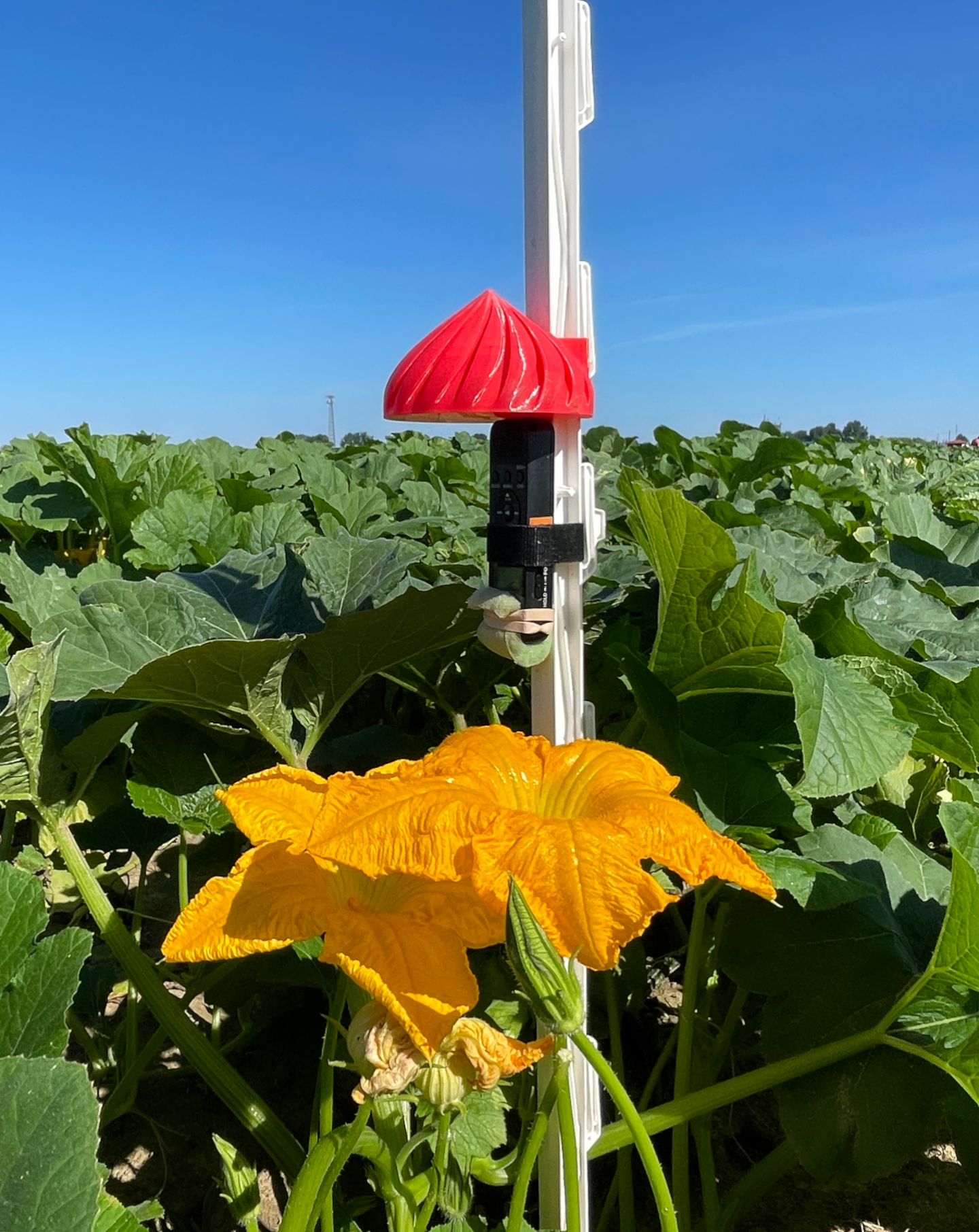
The recordings were taken from five types of flower: pumpkin, chicory, watermelon, mustard, and soybean. For each flower, eight recorders were affixed to plastic step-in fence posts, protected with a 3D printed raincover, and deployed as close to the flower as possible. The resulting audio was trimmed to one full day of recording, midnight-to-midnight. Recordings from the same flower were all taken at the same time and location, but different flowers were recorded on different days.
We used Sony ICD-PX370 MP3 recorders for monitoring. Audio was recorded at 44.1 kHz and a highly compressed 48 kbps. Each recording is named according to the start time of the audio, Eastern Standard Time in the format YYMMDD_HHMM.
The audio files are organized into folders according to the following structure: [flower]/[recorder_id]/[audio file]. For example:
full_recordings
├── chicory
│   ├── 1_104
│   │   └── 250704_0000.mp3
│   ├── 1_109
│   │   └── 250704_0000.mp3
│   └── ...
├── mustard
│   ├── 1_103
│   │   └── 240904_0000.mp3
│   ├── 1_29
│   │   └── 240904_0000.mp3
│   └── ...
└── ...
Results files
Each audio file buzzdetect analyzes produces one output results file. The file names will be identical, with the addition of a “_buzzdetect” suffix to the results file. buzzdetect also clones the directory structure of the input files, so for the audio in this dataset, the results look like:
full_results
├── chicory
│   ├── 1_104
│   │   └── 250704_0000_buzzdetect.csv
│   ├── 1_109
│   │   └── 250704_0000_buzzdetect.csv
│   └── ...
├── mustard
│   ├── 1_103
│   │   └── 240904_0000_buzzdetect.csv
│   ├── 1_29
│   │   └── 240904_0000_buzzdetect.csv
│   └── ...
└── ...
A results file is a CSV. Every row in the CSV is one frame of audio. The “start” column records the start time of each frame. There is no “end” column, since the end is always one framelength after the start. For model_general_v3, every frame is 0.96 seconds long, so a frame with a start of 10.00s ends at 10.96s. The remaining columns in the results hold the activation values for the model’s neurons. These are all prefixed with “activation_”. We’re usually only interested in the “activation_ins_buzz” columns, and buzzdetect allows you to drop certain columns during analysis, so you might not see all neurons in your results files. Non-buzz neurons only exist to improve model training, though it may be possible to use them to detect events relevant to your study such as rainfall and noise pollution. Anecdotally, the model_general_v3 “ambient_rain” neuron seems to detect medium and heavy rainfall decently well at a threshold of -1.
Downloading the dataset
From the beginning: audio data
If you would like to truly start from square one, you can download the Zenodo repository. The raw audio files are in data/raw/full_recordings/, but you have to download the whole repository in one go. Use the extracted folder as your working directory (there’s already an R project file in the repository, buzzdetect.Rproj).
The repository also contains numerous supplementary code files for reproducing the figures and statistical analyses that appear in the manuscript. We’ll be going through similar steps here, but feel free to poke around and steal code at will.
Proceed to Step One: Analyze.
Skipping ahead: buzzdetect results
This is a trimmed-down version of the results from a run of model_general_v3 on the raw audio with a of 1. These are functionally identical the the full results appearing in the Zenodo repository at data/raw/full_results. A few changes have been made compared to the repository:
The “ins_buzz” column has been renamed to “activation_ins_buzz” to correspond to current buzzdetect and buzzr nomenclature
Neurons have been trimmed to ins_buzz, ambient_rain, ins_trill, and mech_plane.
Activations have been rounded to the tenths place.
Extract this folder to your working environment. You’ll see it has two folders, full_results/ and snip_results. We want the first one for this walkthrough. The following steps will assume the results from the full_results folder are stored in data/intermediate/full_results. E.g., data/intermediate/full_results/chicory/1_37/250704_0000_buzzdetect.csv.
Proceed to Step Two: Shape.
Step One: Analyze with buzzdetect
Because buzzdetect is in active development, this walkthrough won’t cover buzzdetect analysis in-depth. Hop over to the buzzdetect documentation for instructions on processing audio with buzzdetect.
Choose the full_recordings directory as your input folder; output your results to data/intermediate/full_results. Set the output mode to activations and choose at least the “ins_buzz” neuron for output.
This walkthrough was made using results from model_general_v3. If you use a different model, the results might be a little different.
Step Two: Shape with buzzr
You should now have your buzzdetect results from the five flowers stored in data/intermediate/full_results.
Loading data
While the cloned output files respect the user’s structure, dozens of separate CSV files are a headache to read into R, right? Wrong! buzzdetect has a companion package, buzzr, that will handle reading and joining results for us. buzzr is doing a lot under the hood, but I’ll leave the detailed explanation to the buzzr walkthrough.
Note
Even though I loaded buzzr, I’m going to use the double colon operator :: in these code blurbs. That way, it’s clear which functions are from buzzr.
Reading in our data is a single buzzr call:
- 1
- Point to the data directory
- 2
- Set the threshold to call a buzz at -1.2; we consider a buzz present if the neuron activation is above -1.2. This threshold should be 28% sensitive with a 0.3% false positive rate.
- 3
-
Tell buzzr how to interpret our directory structure. We have a folder named with the type of flower, then a folder named with the recorder ID. Thus:
c('flower', 'recorder') - 4
-
Give the information needed to interpret date-times from the file names. We need both the POSIX format of the timestamp (see
help("format.POSIXct")) and the time zone that these timestamps reflect. Our recorders use HHMMDD_YYMM. - 5
- Set the width of the bins to 5 minutes. This is a starting point, but different applications need different bin widths.
- 6
- Let buzzr calculate the detection rates for us. This will produce a “detectionrate_” column corresponding to each “detections_” column. It’s simply the detections divided by the total frames.
    flower recorder        bin_datetime detections_ins_buzz frames
    <char>   <char>              <POSc>               <int>  <num>
1: chicory    1_104 2025-07-04 00:00:00                   0    313
2: chicory    1_104 2025-07-04 00:05:00                   1    312
3: chicory    1_104 2025-07-04 00:10:00                   0    313
4: chicory    1_104 2025-07-04 00:15:00                   0    312
5: chicory    1_104 2025-07-04 00:20:00                   3    313
6: chicory    1_104 2025-07-04 00:25:00                   0    312
   detectionrate_ins_buzz
                    <num>
1:            0.000000000
2:            0.003205128
3:            0.000000000
4:            0.000000000
5:            0.009584665
6:            0.000000000
Step Three: Plot
library(ggplot2)Let’s explore these data a little bit to motivate our statistics and get a sense of what we can do with bioacoustic results. We’ll do our plotting with ggplot2.
Activity curves
First up, my favorite visualization: the activity curve. This is the trend of pollinator activity across the course of the day for each flower. This isn’t a common visualization; usually researchers are interested in point estimates such as the total number of bees. But activity curves flex the immense temporal resolution of bioacoustics
ggplot(
  results,
  aes(
    x = bin_datetime,
    y = detectionrate_ins_buzz,
    color = flower
  )
) +
  geom_point()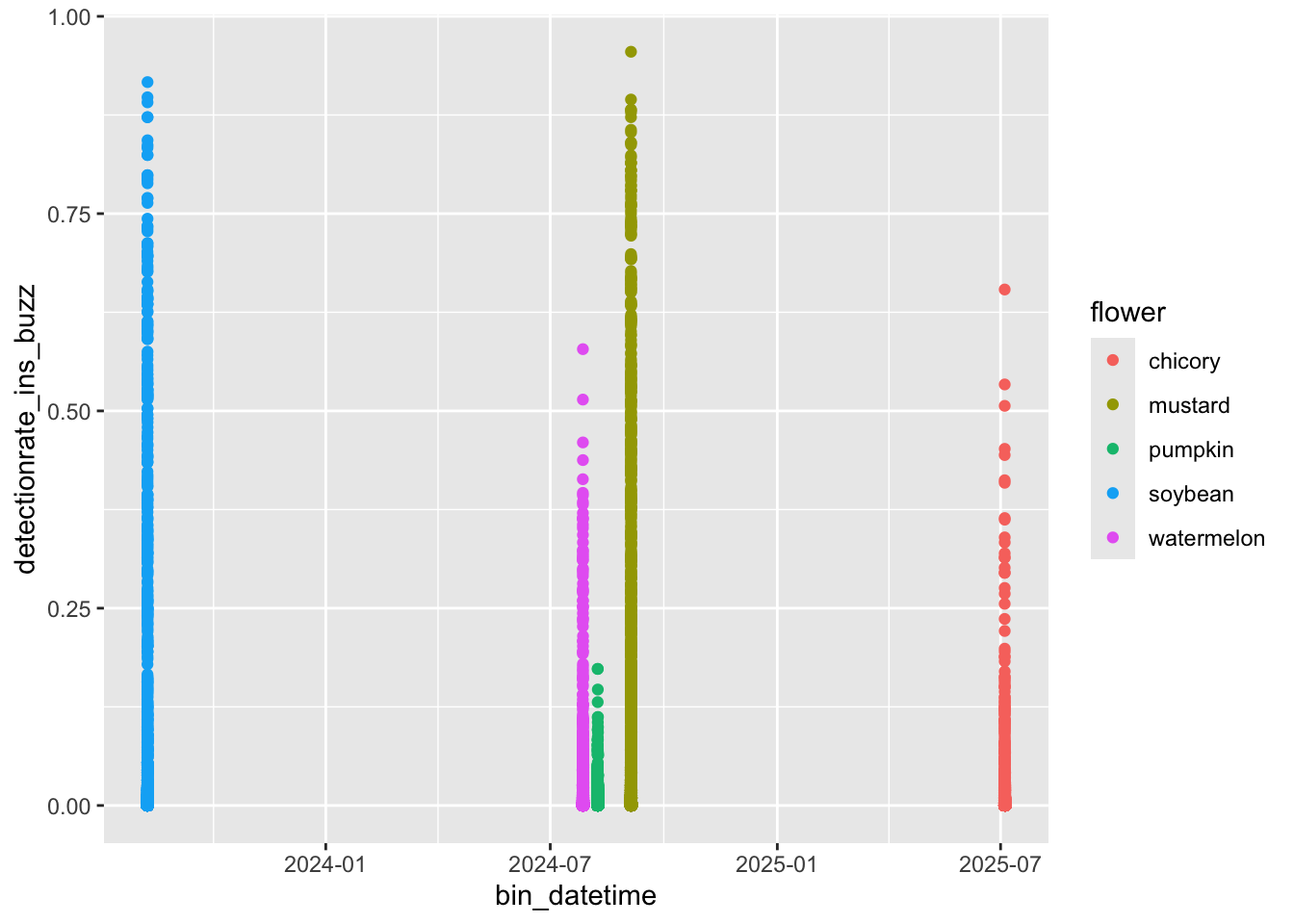
Aha! Here’s a common issue: all of these recordings were taken at different times of the season. How are we supposed to plot them on a common X axis? We could coerce the hour and minute to a numeric value so that 0.50 is noon, but then our X axis would be difficult to interpret. buzzr has a convenience function, buzzr::commontime that forces the year, month, and day of any input time value to 2000-01-01, allowing for pretty plotting. Let’s try it.
results_plot <- results %>%
  # we'll smooth out the curves for nicer plotting
  buzzr::bin(20, calculate_rate = TRUE) %>%
  mutate(commontime = buzzr::commontime(bin_datetime))

ggplot(
  results_plot,
  aes(
    x = commontime,
    y = detectionrate_ins_buzz,
    color = flower
  )
) +
  geom_point()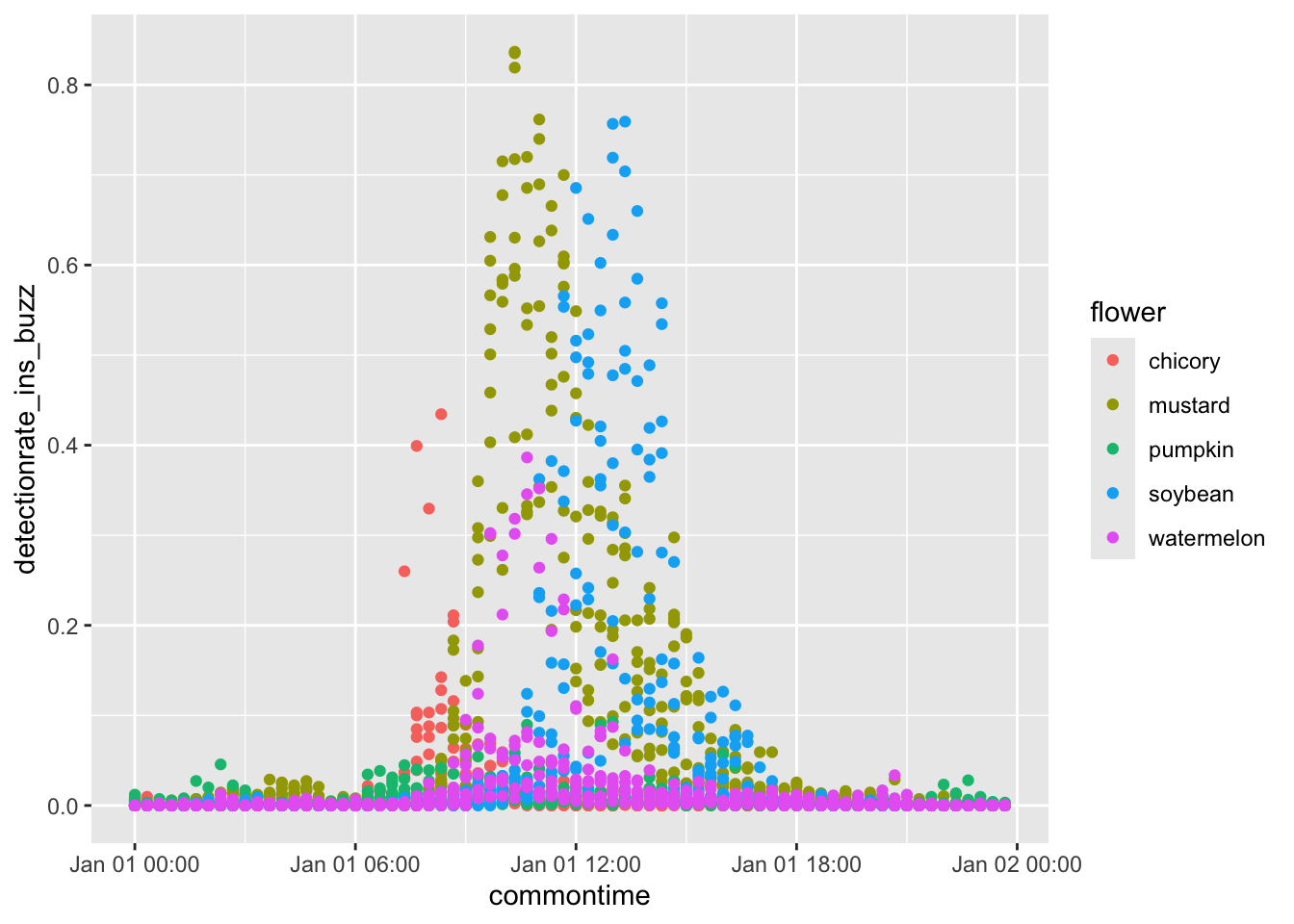
Much better. Now, for full beautification.
ggplot(
  results_plot,
  aes(
    x = commontime,
    y = detectionrate_ins_buzz,
    color = flower,
    group = interaction(flower, recorder)
  )
) +
  geom_path() +
  facet_grid(rows=vars(flower), scales='free_y') +
  buzzr::theme_buzzr(14) +
  scale_x_datetime(labels=buzzr::label_hour(), expand=expansion(0,0)) +
  scale_y_continuous(expand=expansion(mult=c(0.02,0.1))) +
  xlab('time of day') +
  ylab('detection rate') +
  theme(legend.position='none')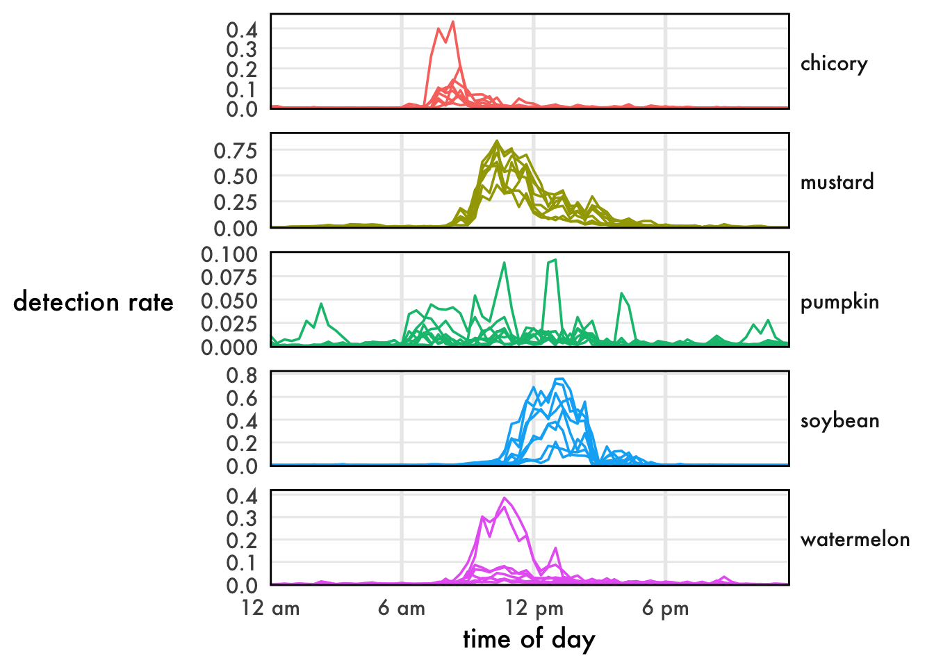
Lovely!
Point estimates
Sometimes we don’t care about time, we just want to compare total activity rates.
results_summary <- results %>%
  group_by(flower, recorder) %>%
  summarize(
    frames = sum(frames),
    detections_ins_buzz = sum(detections_ins_buzz)
)ggplot(
results_summary,
aes(
x = flower,
y = detections_ins_buzz,
fill = flower,
color = flower
)
) +
geom_boxplot(linewidth=0.8, alpha=0.2) +
scale_y_continuous(labels = function(l){format(l, big.mark=',')}) +
buzzr::theme_buzzr(14) +
theme(legend.position = 'none') +
ylab('total\ndetections')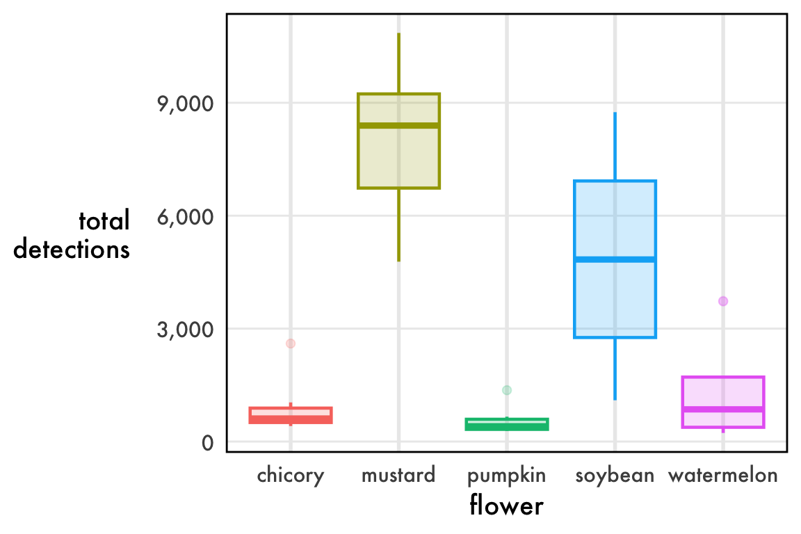
Not bad, but what’s with the outliers? Chicory, pumpkin, and watermelon all have dots above the whisker, which are far from the center of the data.
The issue is, these data aren’t remotely normal. In fact, they’re bounded on both ends: you can’t have fewer than 0 detections, but you also can’t have more detections than you have frames. The true nature of these data is a rate, the number of positive frames divided by the total number of frames. We call this the detection rate. A sampling of detection rates near 0.50 is roughly normal, b
As a rate, the data are (0,1) bounded and so they necessarily press up against 0.
ggplot(
  results_summary,
  aes(
    x = flower,
    y = log10(detections_ins_buzz),
    fill = flower,
    color = flower
  )
) +
  geom_boxplot(linewidth=0.8, alpha=0.2) +
  scale_y_continuous(
    labels = function(l){format(10^l, big.mark=',')},
    breaks = log10(c(500, 1000, 2000, 5000, 10000))
  ) +
  buzzr::theme_buzzr(14) +
  theme(legend.position = 'none') +
  ylab('total\ndetections\n(log scale)')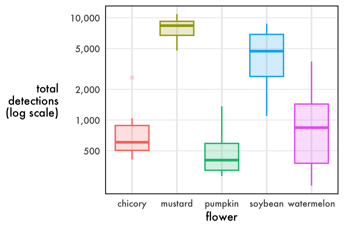
I haven’t found a great way to plot distributions of detection rates. Linear axes squish the data. Log axes are annoying to interpret. Boxplots imply “outliers” that are completely expected. Violin plots promise more than they deliver. The reality is that these data are beta distributed and we might be best off plotting the confidence intervals of the precision and mean parameters, but that makes a very inaccessible figure. My best advice for now: just do a boxplot on the linear scale make sure to note that the outlier dots are completely expected.
Step Four: Model
Detection rates
Warning
Be careful when interpreting the results from detection rates. Bioacoustics demans a number of unique considerations. Detections are downstream of pollinator loudness, background noise, the amount of buzzing produced by an individual visit (which is downstream of floral morphology), and the quality of buzzing (i.e., different pollinators will produce different sounds). Any of these can become confounds if the experimental design does not account for it. For example, the same number of bees is certain to produce more buzzes in mustard (with numerous, small flowers that they fly between) than it will in watermelon (with fewer, larger flowers that they can land on and walk into). The stats in this section are just demonstrative.
Here, we’ll model samples of detection rates. By this I mean not the activity rate over time, but “given recorders in this group and recorders in that group, what was the difference in detections? Remember: summed detection rates look like counts, but they’re actually rates. You can’t have fewer than 0, you can’t have more than the number of your frames. As such, we should generally use beta regression, although sometimes linear regression may work. If beta regressions are new to you, Andrew Heiss has a wonderful guide to get you started.
Let’s modify the results_summary we made in the plotting section to calculate our detection rate.
results_summary$detectionrate_ins_buzz <- results_summary$detections_ins_buzz/results_summary$framesFixed beta model
Let’s start with a simple model using the package betareg.
model_fixed <- betareg::betareg(
  detectionrate_ins_buzz ~ flower,
  data = results_summary
)
We’ll use emmeans to rigorously test this model. Learn more about statistical testing with emmeans here.
contrast_fixed <- emmeans::emmeans(model_fixed, specs = ~flower) |>
  pairs()

plot(contrast_fixed)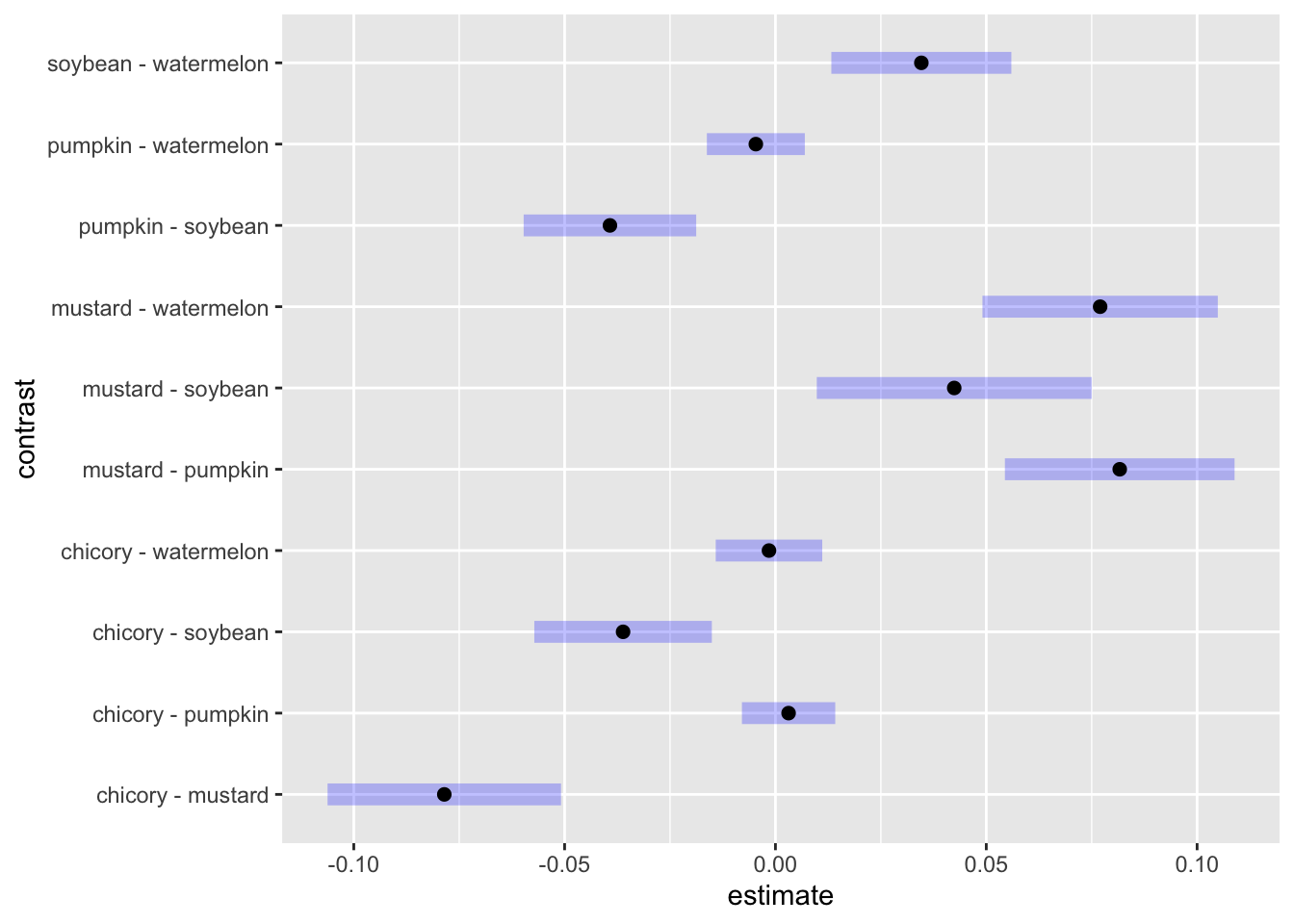
The blue lines are our 95% confidence intervals for the pairwise contrast. Where the blue lines don’t cross 0, we can consider the two detection rates to be significantly different at the α = 0.05 level. As a filtered table:
contrast_fixed |>
  as.data.frame() |>
  filter(`p.value` < 0.05)
contrast estimate SE df z.ratio p.value
chicory - mustard -0.07853511 0.010148965 Inf -7.738 <.0001
chicory - soybean -0.03613594 0.007717661 Inf -4.682 <.0001
mustard - pumpkin 0.08165092 0.009984653 Inf 8.178 <.0001
mustard - soybean 0.04239918 0.011949612 Inf 3.548 0.0036
mustard - watermelon 0.07700177 0.010231059 Inf 7.526 <.0001
pumpkin - soybean -0.03925174 0.007500868 Inf -5.233 <.0001
soybean - watermelon 0.03460259 0.007825124 Inf 4.422 0.0001
P value adjustment: tukey method for comparing a family of 5 estimates The estimate here is the effect on the mean parameter of the beta regression. This is not the same thing as the effect on the detection rate. Read Heiss’s guide for more info.
Mixed beta model
Your experimental design may be hierarchical or contain repeated measures. betareg does not allow for random effects. To account for random effects in a beta regression, you’ll need to use glmmTMB. We don’t have random effects in this dataset, but if for example we collected data from multiple sites, it would look like:
model_mixed <- glmmTMB::glmmTMB(
  detectionrate_ins_buzz ~ flower + (1 | site),
  data = results_summary,
  family = glmmTMB::beta_family()
)
And we could test with emmeans using a similar approach.
Linear model
Rates aren’t normally distributed, but they might not be far off. I always encourage using the most appropriate statistical model, but linear regressions are robust to violations of the assumption of normality, so we can linearly model rates as a quick-and-dirty test.
model_linear <- lm(
  detectionrate_ins_buzz ~ flower,
  data = results_summary
)car::qqPlot(resid(model_linear))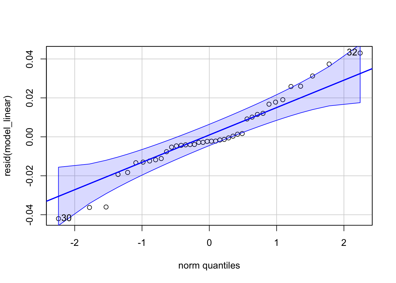
Good enough for most reviewers! If your rates are closer to 0, your residuals will be less normal. Even in this case, taking the log is usually close enough to pass a Q-Q plot. Again, I still encourage modeling your data appropriately, especially because the parameters of a beta regression are much more informative than those of a pseudo-linear model.
Time of day
One of the most compelling applications of bioacoustics is for fine-resolution phenology. It sure looks like the flowers differ in timing. Is it statistically significant?
Let’s try out a model. I find that the peak times of detections per recorder are reasonably normally distributed, so we can use a simple linear model. Unfortunately, the low detection rate in pumpkin leads to noise that hides the underlying trend, so we’ll drop it from this analysis.
peaktimes <- results %>%
  group_by(flower, recorder) %>%
  slice_max(order_by=detections_ins_buzz, with_ties = FALSE) %>%
  mutate(time_peak = buzzr::time_of_day(bin_datetime, time_format='hour'))
model_peaks <- lm(
time_peak ~ flower,
data = peaktimes %>%
filter(flower!='pumpkin')
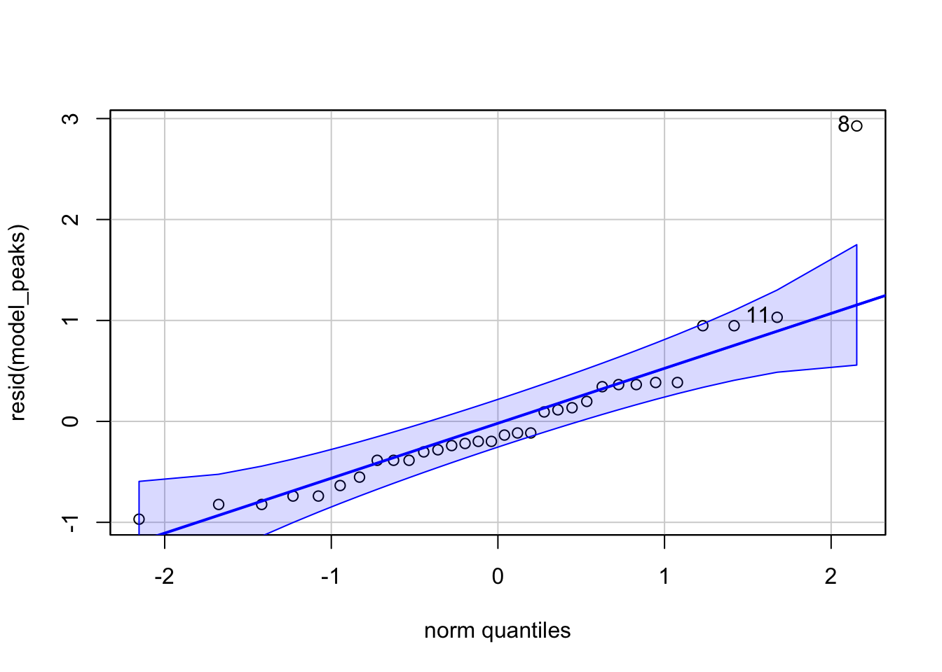
)car::qqPlot(resid(model_peaks))